
What Makes a User Interface Truly Intuitive?
In today’s digital landscape, intuitive UI design isn’t just a nice-to-have—it’s a business imperative. Studies show that 88% of online consumers are less likely to return to a site after a bad user experience, while well-designed user interfaces can increase conversion rates by up to 400%. But what exactly transforms a functional interface into an intuitive, user-friendly experience that keeps people engaged?
An intuitive user interface anticipates user needs, eliminates friction, and guides users naturally toward their goals. It’s the difference between a customer completing a purchase in three clicks versus abandoning their cart in frustration. The secret lies in implementing specific, essential UI components that work together to create a cohesive, gratifying user experience.
The Psychology Behind Intuitive Design
Intuitive user experience design leverages fundamental principles of human psychology and behavior. Our brains are pattern-recognition machines, constantly seeking familiar structures and logical flows. When a user interface aligns with these mental models, interaction feels effortless and natural.
Research in cognitive psychology reveals that users form mental models within the first 50 milliseconds of viewing an interface. This means your UI design elements must immediately communicate their function and relationship to the overall system. Jakob Nielsen’s usability heuristics, established decades ago, remain relevant because they’re rooted in unchanging aspects of human cognition.
Why Obligatory UI Elements Matter for Business Success
Every successful digital product shares common UI design best practices that aren’t accidental—they’re strategic business decisions. These obligatory UI elements serve multiple purposes:
- Reduce Support Costs: Intuitive interfaces decrease customer service tickets by up to 60%
- Increase Conversion Rates: Clear navigation and CTAs directly impact bottom-line revenue
- Improve User Retention: Positive first impressions lead to long-term customer relationships
- Enable Scalability: Consistent design systems allow teams to build faster and more efficiently
The Foundation: Core UI Design Principles Every Interface Needs
Before diving into specific elements, understanding fundamental UX UI design principles provides the foundation for all interface decisions. These principles guide the implementation of every button, menu, and interaction within your system.
Consistency Across All Touchpoints
Consistency in user interface design fosters predictability, thereby reducing cognitive load and enhancing user confidence. This principle extends beyond visual elements to include:
- Interaction Patterns: Similar actions should behave identically across the interface
- Visual Language: Colors, typography, and spacing should follow established rules
- Content Voice: Messaging tone and terminology should remain uniform
- Navigation Structure: Menu organization and labeling should be logical and persistent
Companies like Apple and Google have built entire design systems around consistency, creating interfaces that feel familiar even when users encounter new features. Their success demonstrates how consistent UI design guidelines translate directly into user adoption and satisfaction.
Visual Hierarchy and Information Architecture
An effective visual hierarchy guides user attention through the strategic use of size, color, contrast, and positioning. Users should be able to scan your interface and immediately understand what’s most important.
Information architecture organizes content in a logical and predictable manner. Users shouldn’t have to guess where to find information or how different sections relate to each other. The best user-friendly interface design feels like a natural extension of the user’s thought process.
Feedback and Response Mechanisms
Every user action requires appropriate system feedback. Whether it’s a button press, form submission, or navigation click, users need immediate confirmation that their action was registered and understood. This feedback can be visual (such as color changes or animations), auditory (like sounds), or haptic (like vibrations on mobile devices).
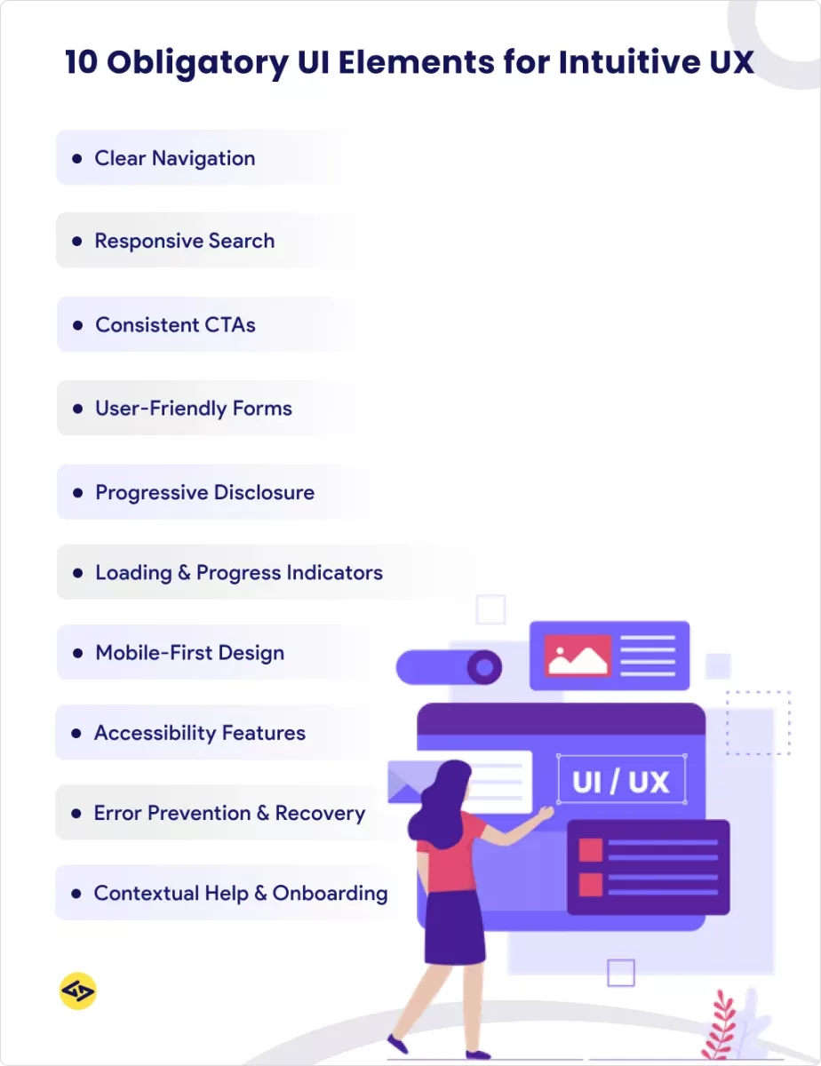
10 Obligatory UI Elements for Intuitive User Experiences
1. Clear and Accessible Navigation Systems
Navigation serves as your interface’s roadmap, helping users understand where they are, where they can go, and how to get back to familiar territory. Intuitive navigation design follows predictable patterns while accommodating your specific content structure.
Primary Navigation Best Practices
Primary navigation should be immediately visible and logically organized. Most users expect to find the main navigation in the header area, with categories arranged from most to least important (left to right in Western interfaces). Key principles include:
- Limit Options: Research shows 7±2 items as optimal for human memory processing
- Use Clear Labels: Avoid clever or ambiguous terminology that might confuse users
- Maintain Visibility: Navigation shouldn’t disappear or become difficult to access
- Indicate Current Location: Users should always know where they are in the site structure
Breadcrumb Implementation Guidelines
Breadcrumbs provide secondary navigation, showing users their path through the site hierarchy. They’re particularly important for content-heavy sites or complex applications. Effective breadcrumbs:
- Start with “Home” as the first level
- Use separators (> or /) that clearly indicate hierarchy
- Make each level clickable except the current page
- Remain visible throughout the user journey
2. Responsive Search Functionality
Search functionality transforms from helpful to essential as the volume of content grows. Responsive UI design ensures search works effectively across all devices and screen sizes.
Search Bar Placement and Design
Search bars should be prominently placed and immediately recognizable. The most effective search implementations:
- Position search in the upper right corner of the desktop interface
- Use sufficient contrast to stand out from surrounding elements
- Include a clear search icon or “Search” button
- Provide adequate input field size for typical queries
Auto-suggestions and Filters
Advanced search features, such as auto-complete and filtering options, dramatically improve the user experience by helping users refine their queries and discover relevant content more quickly. These features should:
- Appear quickly (within 100-200 milliseconds of typing)
- Highlight matching text within suggestions
- Include recent searches when appropriate
- Offer category-based filtering for complex content
3. Consistent Call-to-Action (CTA) Buttons
CTAs represent conversion opportunities, making their design and placement critical for business success. Effective CTA design combines psychology, visual design, and strategic placement to guide user behavior.
Button Design and Color Psychology
CTA buttons should stand out from surrounding elements while maintaining visual harmony with your overall design. Research-backed approaches include:
- Color Contrast: CTAs should have the highest contrast ratio on the page
- Size Hierarchy: Primary CTAs should be larger than secondary actions
- Shape Consistency: Maintain consistent button shapes throughout the interface
- Hover States: Provide clear feedback when users interact with buttons
CTA Copy That Converts
The text on your CTA buttons has a significant impact on conversion rates. Effective CTA copy:
- Uses action-oriented verbs (“Get,” “Start,” “Download”)
- Creates urgency when appropriate (“Get Started Today”)
- Addresses user benefits (“Save 20%,” “Try Free”)
- Remains concise (1-3 words optimal)
4. User-Friendly Form Design
Forms represent critical conversion points where users provide information or complete transactions. Form design best practices can dramatically impact completion rates and user satisfaction.
Form Field Optimization
Well-designed form fields reduce friction and prevent user errors:
- Single Column Layout: Easier to scan and complete than multi-column forms
- Logical Field Order: Match real-world conventions (first name before last name)
- Appropriate Input Types: Use email, phone, and date inputs for a better mobile experience
- Clear Labels: Position labels above fields for better readability
Error Handling and Validation
Error prevention and recovery significantly impact form completion rates:
- Real-time Validation: Check field requirements as users type
- Clear Error Messages: Explain exactly what needs to be fixed
- Positive Reinforcement: Show checkmarks for correctly completed fields
- Error Summary: List all errors at the top of long forms
5. Progressive Disclosure and Information Hierarchy
Progressive disclosure reveals information gradually, preventing cognitive overload while maintaining access to detailed content when needed.
Content Chunking Strategies
Breaking content into digestible sections improves comprehension and reduces abandonment:
- Logical Groupings: Organize related information together
- Scannable Headings: Use descriptive headers that summarize section content
- White Space: Provide visual breathing room between content blocks
- Priority Ordering: Place the most important information first
Expandable Sections and Modals
Expandable content allows users to access additional information without leaving their current context:
- Accordion Sections: Great for FAQ pages and complex forms
- Modal Windows: Useful for detailed information that doesn’t warrant a new page
- Tabs: Organize related content categories efficiently
- Show/Hide Controls: Give users control over information density
6. Loading States and Progress Indicators
Loading states and progress indicators manage user expectations during system processing, reducing perceived wait times and preventing abandonment.
Skeleton Screens vs. Spinners
Different loading states serve different purposes:
- Skeleton Screens: Show content structure while data loads, reducing perceived wait time
- Progress Bars: Indicate completion percentage for determinate processes
- Spinners: Appropriate for quick operations (under 2 seconds)
- Custom Animations: Can reinforce brand personality while users wait
Performance Perception Management
Managing perceived performance often matters more than actual speed:
- Immediate Feedback: Acknowledge user actions within 100 milliseconds
- Progressive Loading: Show partial content as it becomes available
- Optimistic UI: Update interface immediately, then sync with the server
- Meaningful Messaging: Explain what’s happening during longer waits
7. Mobile-First Responsive Design
With mobile traffic surpassing desktop usage, mobile-first responsive design is no longer optional—it’s fundamental to reaching your audience effectively.
Touch-Friendly Interface Elements
Mobile interfaces require different interaction paradigms:
- Minimum Touch Targets: 44px minimum size for tappable elements
- Thumb-Friendly Zones: Place important actions within easy reach
- Gesture Support: Implement swipe, pinch, and pull-to-refresh where appropriate
- Spacing Considerations: Provide adequate spacing between interactive elements
Adaptive Layouts for Different Screen Sizes
Responsive layouts should gracefully adapt to various screen dimensions:
- Flexible Grids: Use percentage-based layouts that scale proportionally
- Scalable Images: Implement responsive image solutions for performance
- Content Prioritization: Show the most important content first on smaller screens
- Navigation Adaptation: Transform desktop menus into mobile-friendly patterns
8. Accessibility Features for Inclusive Design
Accessible UI design ensures that your interface works for users with disabilities, while also often improving usability for everyone.
WCAG Compliance Essentials
Web Content Accessibility Guidelines provide concrete standards:
- Color Contrast: Maintain a 4.5:1 ratio for normal text, 3:1 for large text
- Keyboard Navigation: Ensure all interactive elements are keyboard accessible
- Alt Text: Provide meaningful descriptions for images and icons
- Focus Indicators: Make keyboard focus clearly visible
Screen Reader Optimization
Screen reader compatibility requires semantic HTML and thoughtful structure:
- Heading Hierarchy: Use H1-H6 tags in logical order
- Landmark Roles: Implement ARIA landmarks for page sections
- Form Labels: Associate labels with form inputs programmatically
- Link Context: Ensure link text describes the destination or function
9. Effective Error Prevention and Recovery
Error handling can transform frustrating moments into opportunities to assist users in achieving their goals.
Inline Validation Techniques
Preventing errors before they occur improves user experience significantly:
- Format Guidance: Show expected input formats (phone numbers, dates)
- Character Limits: Display remaining characters for text fields
- Password Strength: Provide real-time feedback on password security
- Duplicate Detection: Alert users to potential duplicate entries
User-Friendly Error Messages
When errors do occur, helpful messaging guides users toward resolution:
- Plain Language: Avoid technical jargon in error descriptions
- Specific Solutions: Explain exactly how to fix the problem
- Contextual Help: Provide assistance relevant to the current task
- Recovery Options: Offer alternative paths when possible
10. Contextual Help and Onboarding Elements
Contextual help systems provide assistance when and where users need it, reducing frustration and support requests.
Tooltips and Progressive Onboarding
Help features should enhance rather than interrupt the user experience:
- Triggered Tooltips: Activate on hover or click rather than automatically
- Progressive Disclosure: Introduce features gradually as users become comfortable
- Dismissible Elements: Allow users to hide help content when no longer needed
- Contextual Timing: Provide help at decision points, not during flow states
In-App Guidance Systems
Sophisticated onboarding systems can dramatically improve user adoption:
- Interactive Tours: Guide new users through key features
- Empty States: Use blank screens to suggest next actions
- Milestone Celebrations: Acknowledge user progress and achievements
- Help Search: Provide a searchable knowledge base within the application
Industry Examples: Successful Implementation of Intuitive UI Elements
E-commerce Platform Case Studies
Amazon’s interface exemplifies numerous intuitive UI design principles in practice. Their search functionality includes auto-suggestions, filters, and spell correction. Product pages use consistent layouts with clear CTAs and comprehensive product information organized through progressive disclosure.
Shopify’s admin interface exemplifies user-friendly interface design for complex business applications. They utilize clear navigation hierarchies, contextual help systems, and consistent design patterns that enable merchants to manage their stores efficiently.
SaaS Application UI Excellence
Slack revolutionized workplace communication through intuitive interface design. Their navigation adapts to user behavior, surfaces relevant information contextually, and provides multiple pathways to accomplish tasks. The interface scales from simple messaging to complex workflow management while maintaining usability.
Notion’s success stems from its flexible yet intuitive building blocks, which enable users to create custom workflows. Their interface demonstrates how progressive disclosure can make powerful tools accessible to non-technical users.
Mobile App Design Success Stories
Instagram’s mobile interface prioritizes content consumption while making creation tools easily accessible. Their navigation utilizes familiar patterns while innovating in areas such as Stories and Reels discovery.
Duolingo gamifies language learning through carefully designed UI elements that provide immediate feedback, track progress, and maintain user motivation through visual rewards and clear advancement paths.
Common UI Design Mistakes That Hurt User Experience
Overcomplication and Feature Creep
Many interfaces struggle to accommodate every possible user need upfront. This leads to cluttered screens, overwhelming navigation, and confused users. Effective UI design prioritizes core user goals and progressively reveals advanced features, allowing users to discover them as needed.
Inconsistent Design Patterns
When similar functions behave differently across an interface, users lose confidence and efficiency. Consistency in interaction patterns, visual styling, and content organization creates predictable, learnable systems.
Neglecting Mobile Users
Designing primarily for desktop and adapting for mobile often results in compromised mobile experiences. Mobile-first design ensures your interface works well for the majority of users who access it via smartphones.
Tools and Resources for Implementing Intuitive UI Design
Essential UI Design Software and Platforms
Modern UI design tools enable rapid prototyping and collaboration:
- Figma: Browser-based design tool with excellent collaboration features
- Sketch: Mac-native design application with an extensive plugin ecosystem
- Adobe XD: Integrated design and prototyping platform
- Framer: Code-based design tool for interactive prototypes
Testing and Validation Tools
Usability testing tools provide data-driven insights into interface effectiveness:
- Hotjar: Heat mapping and session recording for user behavior analysis
- UserTesting: Remote usability testing with real users
- Maze: Rapid prototype testing and validation platform
- Google Analytics: Comprehensive user behavior tracking and analysis
Design System Resources
Design systems accelerate development while ensuring consistency:
- Material Design: Google’s comprehensive design language
- Human Interface Guidelines: Apple’s design principles and patterns
- Ant Design: Enterprise-focused React component library
- Bootstrap: Popular CSS framework for responsive design
Measuring Success: KPIs for Intuitive UI Performance
User Engagement Metrics
Intuitive interfaces typically show improved engagement across multiple metrics:
- Time on Page: Users spend more time with content when navigation is clear
- Pages per Session: Intuitive design encourages exploration
- Bounce Rate: Well-designed landing pages retain more visitors
- Return Visitor Rate: Positive experiences drive repeat usage
Conversion Rate Optimization
UI design best practices directly impact business metrics:
- Form Completion Rates: Well-designed forms see significantly higher completion rates
- Click-through Rates: Clear CTAs generate more engagement
- Cart Abandonment: Streamlined checkout processes reduce abandonment
- Sign-up Conversions: Simplified registration flows improve conversion rates
Usability Testing Methodologies
Quantitative and qualitative testing provide insights into interface effectiveness:
- A/B Testing: Compare interface variations with statistical significance
- User Interviews: Gather qualitative feedback on user experiences
- Task Analysis: Measure completion rates and time-to-completion
- Accessibility Audits: Ensure interfaces work for users with disabilities
Future Trends in Intuitive UI Design
AI-Powered Interface Adaptations
Artificial intelligence increasingly personalizes interfaces based on user behavior patterns. Adaptive layouts, predictive content surfacing, and intelligent automation will become standard UI design elements.
Voice and Gesture-Based Interactions
Voice interfaces and gesture controls are expanding beyond traditional screen-based interactions. Intuitive UI design will need to accommodate multi-modal input methods while maintaining accessibility and usability.
Emerging Technologies Impact
Virtual and augmented reality, Internet of Things devices, and wearable technology create new interface design challenges. The principles of intuitive design remain constant, but their application must evolve for new contexts and capabilities.
Conclusion: Building Interfaces That Users Love
Creating intuitive user interfaces requires understanding both human psychology and business objectives. The ten obligatory UI elements outlined here provide a foundation for interfaces that feel natural, reduce friction, and guide users toward successful outcomes.
Success in UI design stems from the consistent application of proven principles, continuous testing and refinement, and a genuine focus on user needs rather than designer preferences. The most intuitive interfaces feel invisible—users accomplish their goals efficiently without thinking about the interface itself.
As technology continues evolving, the fundamental principles of intuitive design remain constant: understand your users, eliminate unnecessary complexity, provide clear feedback, and test your assumptions with real people. Implement these essential UI components thoughtfully, and you’ll create experiences that users not only tolerate but actively enjoy.
Enhance Your User Interface Today.
Our experts craft UI designs that deliver seamless user journeys and higher engagement.
