
Ever tried opening a website on your phone and thought, “Is this a test of my patience?”
- Pages crawl, patience falls.
- Tiny buttons are too tiny (and no, your fingers aren’t the problem).
- Pinch, zoom—boom! Total doom.
Your customers would encounter this situation while using your website. Your customers leave your site before finishing the phrase “lost lead.”
According to source data, mobile devices account for 60.4% of worldwide web traffic. Not making your website mobile-friendly will assure that your customers will move to competitor sites.
But do not panic! A mobile-first website resolves every issue as follows:
- Loads in a flash, no more dash.
- Looks sleek, feels unique.
- Ranks higher, converts faster.
“…Heard of mobile-first? No worries if not!
We will break down what it is and the importance of mobile-first design in transforming your business.
And that’s just the start. Here’s why mobile-first matters:
- It supercharges sales and conversions.
- It makes your business future-ready.
- A mobile-first website benefits businesses with a seamless user experience, boosting engagement and retention.
Think we’re spilling all the secrets here? Nope.
You’ll have to dive into the blog for that. Let’s go!
What Is a Mobile-First Website?
- A mobile-first website is a design approach that focuses on creating and optimizing a site for mobile devices first.
- Later, the design is adjusted for larger screens like tablets and desktops.
- The mobile-first strategy provides enhanced user experiences to mobile users who represent most internet traffic.
- It ensures important content and features fit smaller screens. A mobile-first website benefits businesses by boosting search rankings.
- Designing for mobile devices at the beginning enables developers to create refined and efficient interfaces.
- A website becomes more usable and accessible across different platforms because of this approach.
Why Is a Mobile-First Website Important for Businesses?
Here are several vital advantages of mobile-friendly websites:
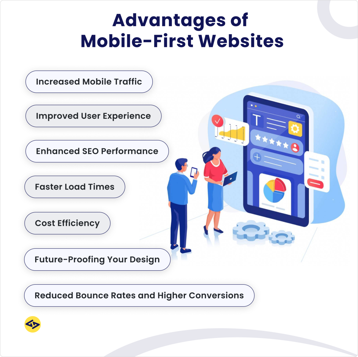
1. Increased Mobile Traffic
Mobile devices make up more than half of all internet traffic today. Businesses that focus on mobile design can effectively engage their mobile audience. A mobile-first website strategy prioritizes optimal performance for small screens from the beginning of the design process. Improved navigation and enhanced user interaction result in increased website traffic.
2. Improved User Experience
A mobile-first design focuses on the importance of mobile responsive design, ensuring a seamless experience across devices. Designers must prioritize essential content when they begin by working on the smallest screen. The design becomes simpler, thus providing better user navigation. Mobile users demand immediate access to data while requiring a perfect user experience because of their time needs.
3. Enhanced SEO Performance
Search engines like Google prioritize a mobile-first website strategy by ranking sites based on their mobile versions. Enhancing your mobile site improves search engine visibility, making it easier for potential clients to discover your business. The key to thriving in a competitive digital market is adhering to search engine algorithm standards. Achieving SEO success largely hinges on having a mobile-responsive design.
4. Faster Load Times
A mobile-first website benefits businesses by creating lightweight pages that load faster on mobile devices. Speed plays a significant role in maintaining visitor interest, especially among users with slower network connections. When websites have mobile-first optimization, their pages load quickly, thereby reducing bounce rates and enhancing user satisfaction. A single second delay can have substantial negative effects on conversion rates.
5. Reduced Bounce Rates and Higher Conversions
A well-designed mobile site lowers bounce rates. Users are more likely to spend time on websites that provide quick access to the information they need. Shoppers often prefer using mobile devices for their purchases. A mobile-friendly website improves business performance by increasing conversion rates. A seamless experience encourages users to make purchases and engage with content.
6. Cost Efficiency
A mobile-first website strategy is more cost-effective than creating separate desktop and mobile versions. Developing a single responsive site saves time and lowers long-term expenses. Implementing core features early reduces development costs, as it avoids the need for redesigns.
Looking for top-tier mobile solutions?
Check out our mobile application development services to create a seamless mobile experience.
7. Future-Proofing Your Design
Technology continues to evolve, with new devices of various screen sizes constantly emerging. A mobile-first website enables businesses to adapt more easily. The significance of mobile-first websites for companies ensures that sites remain functional without major overhauls. Businesses that embrace mobile-first design best practices stay ahead of trends instead of playing catch-up.Want a future-proof website? Hire top UI/UX designers.
Find out how to hire a dedicated developer to bring your project to life.
What Are the Best Practices for Mobile-First Website Design?
Here are the best mobile-first website best practices.
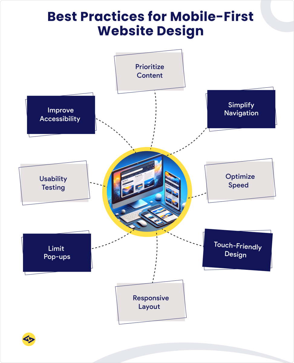
1) Prioritize Content
Show critical content elements at the top. The essential messages and CTAs should be easy to access while avoiding visual overload on users.
2) Simplify Navigation
Use intuitive menus like hamburger icons or bottom navigation bars. This keeps the interface clean and user-friendly.
3) Optimize Speed
Compress images, minimize code, and use efficient hosting. Faster load times improve performance and reduce bounce rates.
Selecting an appropriate backend system plays a crucial role in delivering fast performance.
Explore the top mobile app backend hosting providers for seamless performance.
4) Touch-Friendly Design
Design interactive elements and buttons with sufficient size for smooth tapping functions. Touch-based hover features should be avoided since they work only on desktop interfaces.
5) Responsive Layout
Your site should incorporate flexible grids and media queries. This feature automatically adjusts your website design to different screen dimensions.
6) Limit Pop-ups
Pop-ups should not block content by obscuring it. Non-intrusive banners or slide-ins provide better alternatives to pop-ups.
7) Usability Testing
Regularly test your site on real mobile devices. Identify and address navigation or performance issues before launch.
8) Improve Accessibility
Use high-contrast text and proper spacing to improve readability. Add alt text for images to support visually impaired users. Enhance your website’s usability and user experience with our expert UI/UX design services.
Want to build a mobile-first website? Hire expert web developers to bring your vision to life.
Mobile-First vs. Mobile-Friendly: What’s the Difference?
Understanding Mobile-First vs. Mobile-Friendly
Both approaches cater to mobile users but differ in design priorities. Understanding these differences helps businesses create better user experiences.
1. Mobile-Friendly
- Designed for desktops first and later adapted for mobile.
- Ensures readability and usability on smaller screens.
Key Features:
- Responsive design
Adjusts layouts for different screen sizes.
- Touchscreen compatibility
Ensures buttons and links are easy to tap.
- Fast loading times
Optimizes images and reduces heavy scripts.
2. Mobile-First
- Starts with mobile design before scaling to larger screens.
- Prioritizes content and features for mobile users.
Key Features:
- Progressive enhancement
Adds features for larger screens over time.
- User-centric design
Focuses on mobile behavior and needs.
- Performance optimization
Ensures fast load times on mobile networks.
Why Mobile-First Design Matters in 2025?
1) Better User Experience
Mobile-first design prioritizes the majority of web users.
Over 54% of global traffic comes from mobile devices.
2) Improved Performance
Focuses on fast load times and optimized content.
A one-second delay can reduce conversions by 7%.
3) Clearer Content Strategy
Forces prioritization of essential content.
Reduces clutter for a streamlined user experience.
4) Future-Proof Design
Adapts to various devices, including wearables.
Remains relevant as technology evolves.
5) SEO Advantages
Google prioritizes mobile-optimized sites in rankings.
Better performance leads to lower bounce rates.
Conclusion- Stay Ahead with a Mobile-First Approach
Looking ahead, mobile-first design matters in 2025 because it is about staying competitive. Organizations that focus on mobile-first structure development will achieve superiority in user engagement, search engine rankings, and conversion rates.
A mobile-first website strategy keeps your site adaptable to new devices and technologies.
Do not wait until slow load times and clunky navigation cost you customers.
Embrace mobile-first design and set your business up for long-term success.
At iCoderz, we specialize in website development, helping businesses create high-performance websites that stand out in the market.
Contact us today.
Boost your business with a fast, responsive, mobile-friendly website.
